
A map of the bikes of London
Using Tableau and a pinch of Python to look at ~20,000 bikes and 700+ bike stations.

When I moved to London I exchanged my Vespa for a Boris bike. It was tough going at first but I have come to love these bikes. I ride one almost every day and I could not imagine living in London without them.
Being a "data person" it did not take too long before I started searching for data about the bikes. The program, alternately referred to as "Boris Bikes"/ "Barclays Bikes" / "Santander Cycles" is a "public bicycle hire scheme" and is run by Transport For London (TFL). They offer some basic data feeds.
I had a lot of questions about the bike system, like:
- How many bikes and bike stations exist in London?
- Where are the bikes?
- Which borough has the best coverage?
- How did the network grow?
I used the TFL data to visualize how the bikes are spread out over London and created this visualization (click on the image to go to the interactive version):
In this post I will walk through the process that starts with a CSV file and ends with that interactive visual.
The Data
Let's take a look at the TFL data (which you can grab here). It includes:
- bike station name (usually the street and area where the station is)
- number of bikes that can fit at the station
- longitude and latitude for each station
- the date when the station was installed by TFL
There were also a lot of other fields that I did not end up using. I used OpenRefine to clean the data. For example: the dates needed some work and had to be converted from Mon Jul 12 15:08:00 2010 to a more intuitive format like Jul 12 2010. I also got rid of the columns that did not interest me.
A pinch of Python
At this point I had most of what I needed - a basic sketch of the data - but I was still missing information about the borough where the station was installed. I thought it this would add a meaningful dimension to the data. To be able to visualise this I reverse geocoded the latitude and longitude points from the dataset. This sounds really complicated but is actually really easy. You can use a service like this, but I did it with a pinch of python using the geopy module.
Here is how you use geopy to reverse geocode a set of coordinates:
from geopy.geocoders import Nominatim
geolocator = Nominatim()
location = geolocator.reverse("51.5247497559, -0.096965610981")
print location.address
#47-58, Bastwick Street, Saint Luke's, London Borough of Islington, London, Greater London, England, EC1V 3RD, United Kingdom
In this example it returned the borough name, but it was not always the case. The postcode, however, was a reliable output, so I used that and passed it into the postcodes.io API to get the district/borough. Here is an example call for the EC1V 3RD postcode.
My girlfriend later pointed out that this was overkill and that I could probably have used the bike station name to get most of this data, but it was fun to use geopy and I am really happy to have discovered the very amazing postcodes.io.
"Clean" data
At this point I had a complete dataset (get it here) that included:
- bike station name
- latitude
- longitude
- date that the station was installed
- number of bikes that the station can hold
- the name of the borough where the station is installed
Seeing & understanding
At this point I threw the data at Tableau and started to visualize it.
First I took a look at how many bikes and stations there are by borough:
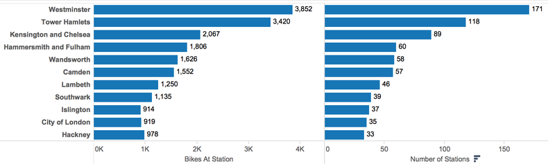
Looks like Westminster dominates there.
What about the biggest stations? There are 743 stations in this dataset. Here I focus on the top 15 while calculating the average number of bikes for all stations:
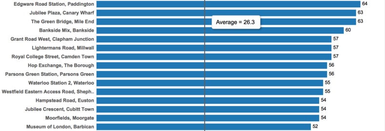
The the bankside station is right outside my office, and even though it is the 4th biggest in all of London it is still hard to find a parking place sometimes.
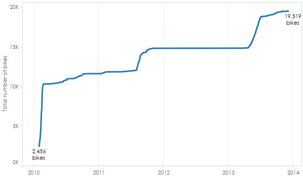
How about how the stations changed over time? How has the number of bikes grown in London? Looks like the first stations were installed in 2010 and that there has been sporadic growth with plateaus of quiet periods (like 2012):
Next is my favourite part: maps. Let's see what these 700+ stations look like on a map of London. I have sized the dots according to the number of bikes that fit at each station (bigger dots = more bikes):
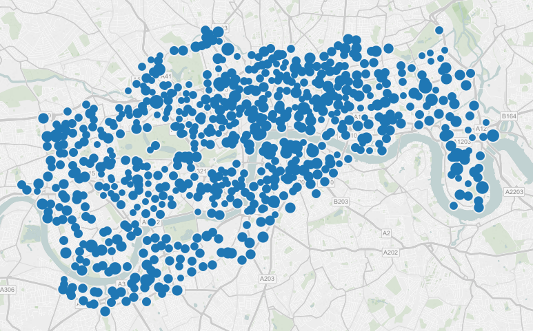
We can instantly see that there are bikes all over London except for the central South-East (I have no idea why).
Next, let's look at when the stations were added. 2010 was the first year of the Boris Bikes but how have they been added since then? Are there any patterns? I made a quick animation to show how the number of distribution has changed over the years:
Looks like things started in the center in 2010 and that 2011 was a slow year while 2012 (during the Olympics) the East got covered in bike stations and in 2013 TFL expanded into the South-West. 2014 was another slow year.
Boroughs
Next I inspected the stations by borough:

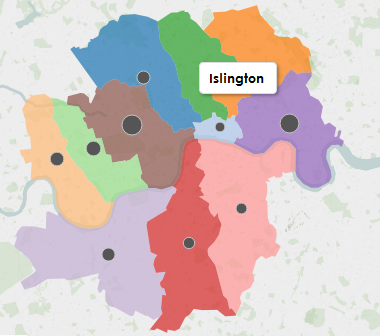
We can start to see why boroughs like Westminster and Tower Hamlets dominate in terms of number of bikes and stations; it looks like the Boris Bike system overlaps nicely with the shape of the borough (i.e. dense coverage), while places like Islington only overlap slightly with the system. To get a better idea let's take a look at the shape of the boroughs.
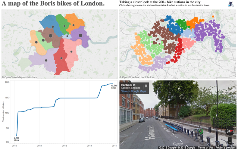
This data does not exist in the TFL data but I will grab it from tableaumapping.bi a fantastic & free source for Tableau geo-data. I used this file to grab the boroughs and filtered it down to only the boroughs that existed in my dataset. I also added a black circle to represent the number of bikes in each borough:
Streets
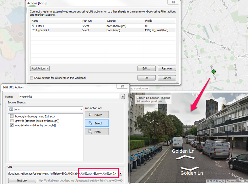
I wanted to tie everything together by showing the individual stations and the streets they are on, to give the full range from a city-wide view to an individual station on a particular street. Since I already had the longitude and latitude of each bike station, I decided to use the google streetview API to embed an interactive view of each station. To do this I embedded a streetview frame and used the each point on the map as a filter that would pass new latitude and longitude values to the streetview container when a station is selected.
Connecting it all
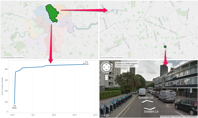
I wanted to show the size of the system while still letting people take a look at their neighbourhood or event individual stations. To achieve this jump between scales I decided to connect everything so that clicking a borough restricts the view to only that selection. Then by clicking on an individual station you would see the street where the bikes were:
Finally
Here is what it looks like when everything is put together (that is the station in Islington where I usually grab a bike in the morning).

You can see the interactive visualization on Tableau Public.
novice at life, ok at data stuff.
